Interactivity
Interactive
elements
Shiny is fine!
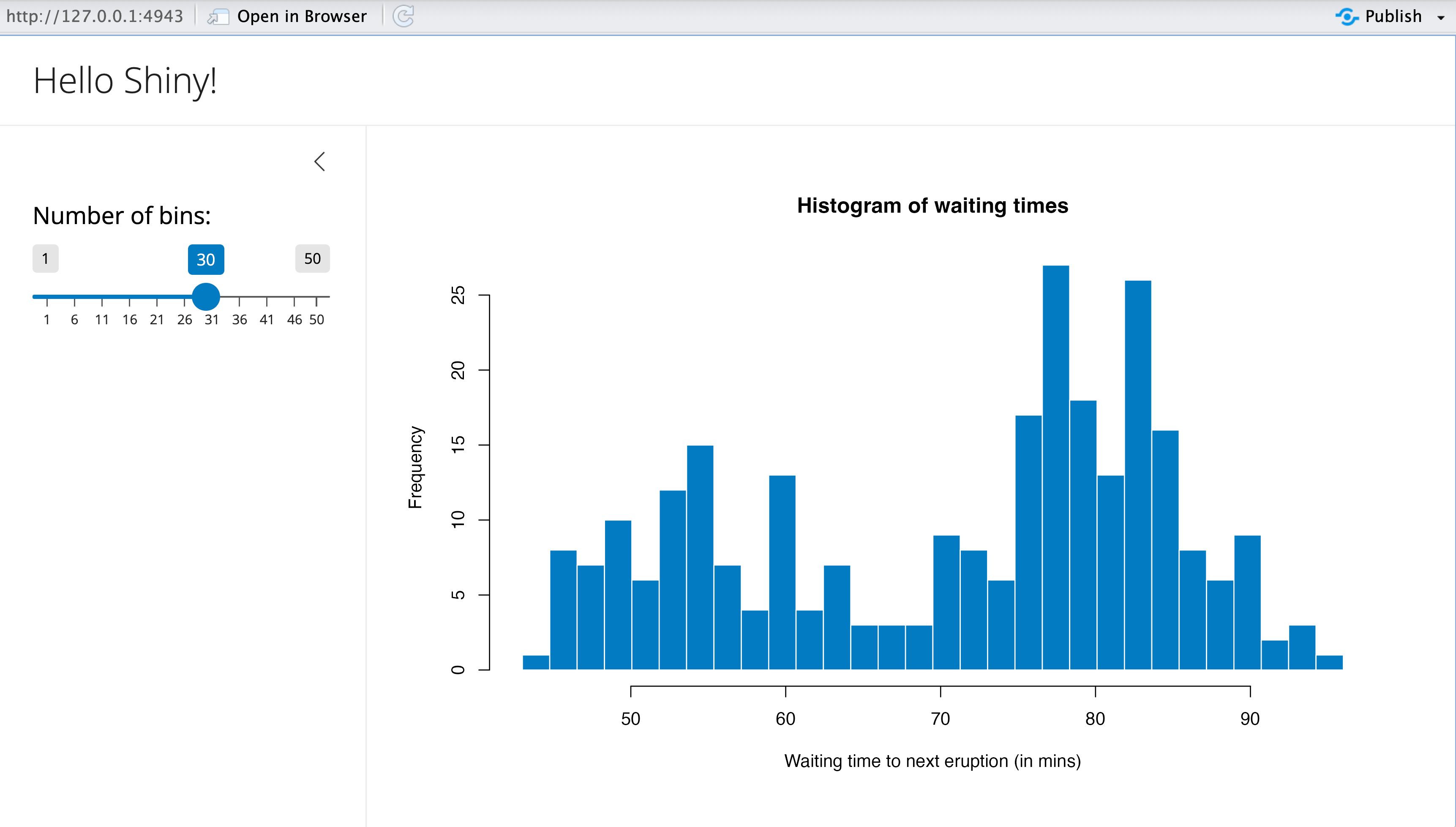
But Shiny has problems!
Requires a whole live server
Is often difficult to learn
Slow to load
Times out regularly
![]()
Newer approaches to interactivity
- {plotly} and {ggiraph}
- Regular R + ggplot, but can’t deal with live data
- Observable JS
- Can deal with live data (even remote APIs), but uses a different language
- quarto-live (✨LITERAL MAGIC✨)
- Can deal with live data and uses regular R/Python
Plotly
plotly::ggplotly() automatically converts ggplot objects to plotly plots
Documentation: https://plotly.com/ggplot2/
{ggiraph}
Documentation: https://davidgohel.github.io/ggiraph/
Observable Plot
This is R:
This is Observable JS:
Observable Plot
viewof current_year = Inputs.range(
  [1952, 2007],
  {value: 1952, step: 5, label: "Year:"}
)

// Filter the data based on the selected year
gapminder_filtered = gapminder_js.filter(d => d.year == current_year)

Plot.plot({
  x: {type: "log"},
  marks: [
    Plot.dot(gapminder_filtered, {
        x: "gdpPercap", y: "lifeExp", fill: "continent", r: 6,
        channels: {
          Country: d => d.country
        },
        tip: true
      }
    )
  ]}
)
viewof current_year = Inputs.range(
[1952, 2007],
{value: 1952, step: 5, label: "Year:"}
)
// Filter the data based on the selected year
gapminder_filtered = gapminder_js.filter(d => d.year == current_year)
Plot.plot({
x: {type: "log"},
marks: [
Plot.dot(gapminder_filtered, {
x: "gdpPercap", y: "lifeExp", fill: "continent", r: 6,
channels: {
Country: d => d.country
},
tip: true
}
)
]}
)Observable Plot examples
Our turn
Play with {plotly} and {ggiraph}
Together we’ll make some plots with plotly::ggplotly() and ggiraph::girafe() (see this for a general ggplotly tutorial)
I’ll post all the final code on the course website when we’re done.
Play with Observable
jk we won’t do that today. It’s a whole different language and takes a while to get used to. Do this on your own—it’s neat!
10:00
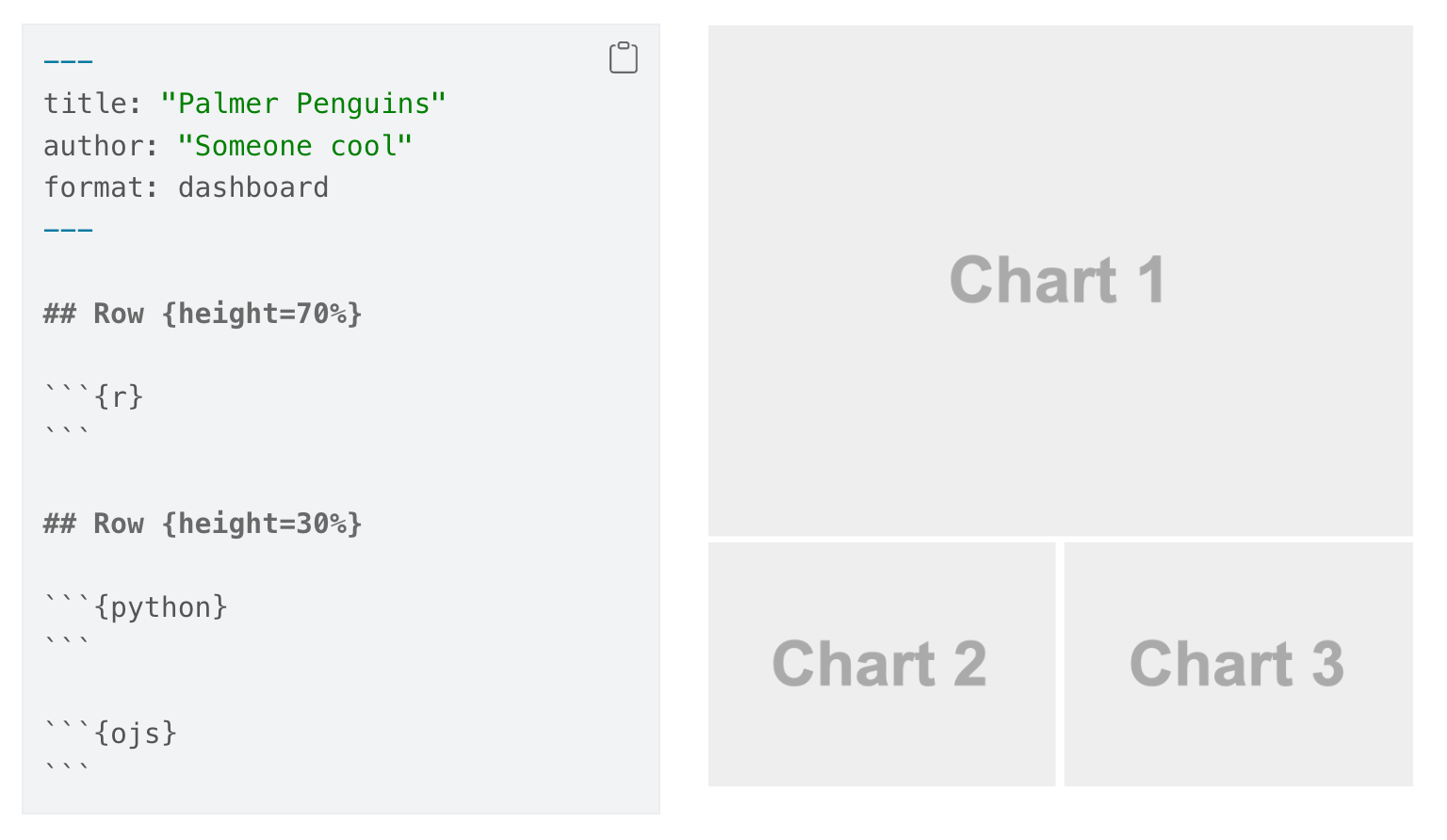
Dashboards
Dashboard detour
With {plotly} and {ggiraph}, you know enough to make basic dashboards!
Documentation: https://quarto.org/docs/dashboards/
Dashboard layouts
Quarto uses special Markdown syntax to place dashboard components in dashboard layouts.
Documentation: https://quarto.org/docs/dashboards/layout.html
Dashboard components
- Plots
- Tables
- Value boxes
- Text and content cards
Documentation: https://quarto.org/docs/dashboards/data-display.html
Dynamic content
- Dashboards are still static HTML sites
- If using live data, you’re limited(ish) to OJS
- Dashboards can connect to Shiny servers though
- But then the site has to live on a Shiny server
Our turn
Make a dashboard about penguins
Together we’ll make an interactive dashboard about the Palmer Penguins.
I’ll post all the final code on the course website when we’re done.
20:00
webR and
Quarto Live
R in the browser
webR is a special version of R that’s compiled for Javascript and Node.js using WebAssembly
tl;dr
Through compiled Javascript magic, you can run R in your browser.
Quarto Live makes it trivial to use (and it works with Python and Pyodide)
Enabling webR
Install the extension:
Use special format and include special file (for now)
Using webR
Make webr chunks
Install packages
You don’t have access to every package on CRAN; packages have to be compiled for WebAssembly/Javascript (many/most are though!)
Packages come from the webR public package repository
Teaching with webR
exercise.qmd
More with exercises
Use OJS to interact with live R
Replicate/replace basic Shiny apps!
Old Faithful app
Classic Old Faithful Shiny example
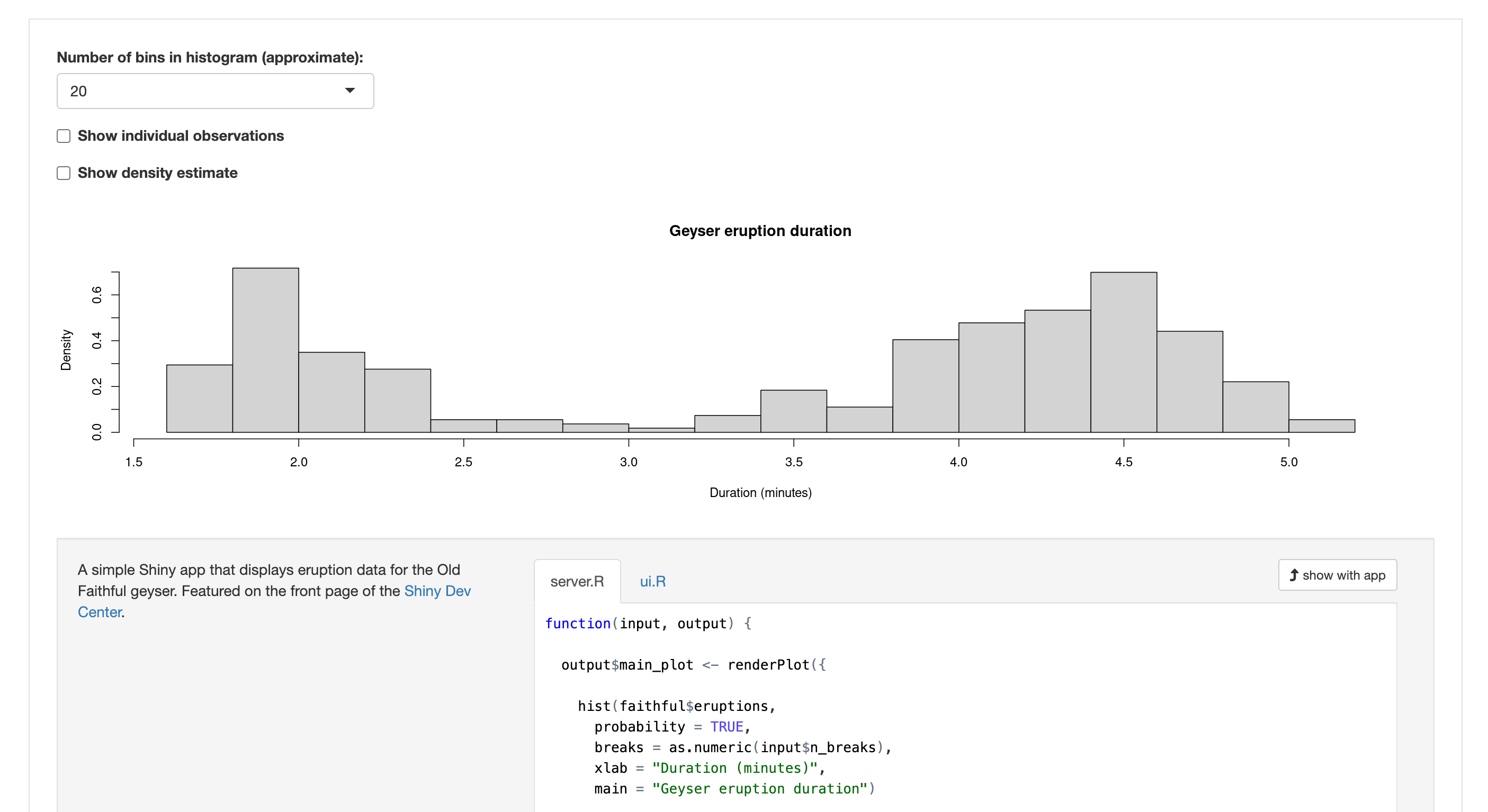
Old Faithful app with OJS
(2 hours fighting with Claude…); see website for full code
faithful_js = transpose(faithful)

viewof nbins = Inputs.select(
  [10, 20, 35, 50],
  {label: "Number of bins"}
)

viewof individual_obs = Inputs.checkbox(["Show individual observations"], {
  value: []
})

viewof density = Inputs.checkbox(["Show density estimate"], {
  value: []
})

viewof bw_adjust = Inputs.range([0.2, 2], {
  label: "Bandwidth adjustment:",
  step: 0.2,
  value: 1
})Plot.plot({
height: 300,
y: { label: "Density" },
x: { label: "Duration (minutes)" },
marks: [
// Probability-based histogram
Plot.rectY(
faithful_js,
Plot.binX(
{ y: (bin, { x1, x2 }) => bin.length / faithful_js.length / (x2 - x1) }, // Normalize to probability density
{ x: "eruptions", thresholds: nbins } // Use nbins for threshold count
)
),
// Zero line
Plot.ruleY([0]),
// Individual observations
// Individual observations (separate layer for ticks)
individual_obs.length > 0
? Plot.dot(faithful_js, {
x: "eruptions",
y: (d) => jitter(d.eruptions, 0.05), // Deterministic jitter based on data
// y: () => Math.random() * 0.05, // Jitter points randomly along the y-axis
stroke: "white",
fill: "red",
})
: null,
// Density line
density.length > 0
? Plot.line(
densityEstimate(
faithful_js.map((d) => d.eruptions),
bw_adjust // Bandwidth adjustment
),
{ x: "x", y: "density", stroke: "blue" }
)
: null,
].filter((d) => d !== null),
});function densityEstimate(values, bwAdjust) {
const kde = kernelDensityEstimator(
kernelEpanechnikov(0.2 * bwAdjust), // Kernel function
d3.scaleLinear().domain(d3.extent(values)).ticks(200) // Evaluate KDE at 200 equally spaced points
);
return kde(values);
}
// Kernel density estimator function
function kernelDensityEstimator(kernel, X) {
return function (sample) {
return X.map((x) => ({
x: x,
density: d3.mean(sample, (v) => kernel(x - v)), // Adjusted scaling
}));
};
}
// Epanechnikov kernel function
function kernelEpanechnikov(bandwidth) {
return function (u) {
return Math.abs(u /= bandwidth) <= 1 ? (0.75 * (1 - u * u)) / bandwidth : 0;
};
}
// Deterministic jitter function because Math.random() doesn't support seeds
function jitter(value, range) {
const hash = Math.sin(value) * 10000; // Generate pseudo-random hash based on value
return (hash - Math.floor(hash)) * range; // Scale hash to the desired range
}Old Faithful app with webR
(8 minutes reading the documentation); see website for full code
viewof nbins_r = Inputs.select(
  [10, 20, 35, 50],
  {label: "Number of bins"}
)

viewof individual_obs_r = Inputs.toggle({
  label: "Show individual observations",
  value: false
})

viewof density_r = Inputs.toggle({
  label: "Show density estimate",
  value: false
})

viewof bw_adjust_r = density_r
  ? Inputs.range([0.2, 2], {
      label: "Bandwidth adjustment:",
      step: 0.2,
      value: 1
    })
  : html`<input type="range" value="1" style="display:none">`
Our turn
Together we’ll do this:
- Create a {webr} chunk that helps teach something and provides feedback
- Recreate the Shiny k-means example
- Bonus: Make a live ggplot plot!
I’ll post all the final code on the course website when we’re done.
20:00
What’s next?
Course outline
- ✅
Intro to Quarto - ✅
Creating basic websites - ✅
Advanced website features - ✅
Publishing - ✅
Customization and branding - ✅
Interactivity
Stay curious and
keep playing